You probably have very strong mental images of the illustrations in your favorite picture books—Clifford’s bright red fur, the pasta pot bubbling over in Strega Nona, Pokey the Puppy digging in the garden.
In all likelihood, though, they didn’t start out looking that way. Artists often produce many drafts of each picture, sometimes unveiling details that add a new perspective to the story, other times shifting the color palette to convey a different mood.
In honor of Picture Book Month, we decided to shed a bit of light on this process, and asked Scholastic illustrators to compare a draft of an image to the final version and explain the reasons behind their edits. See their answers, below, and gain a whole new appreciation for the work that goes into the drawings, paintings and collages that children and adults alike find so unforgettable.
Peter Sís - Robinson
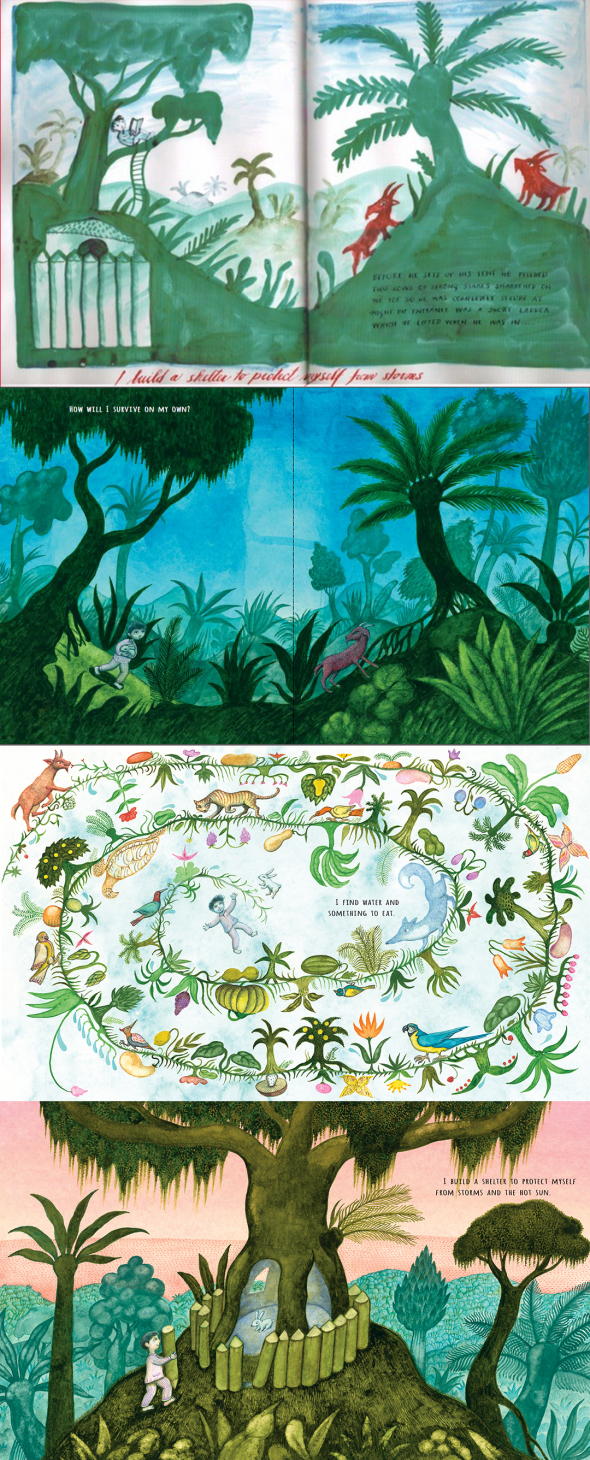
Peter says, "I always loved the idea of deep green, unknown, mysterious islands with goat inhabitants. I was also intrigued by the idea of Robinson building his shelter.
But I then decided (with my editor, Tracy Mack, and art director, David Saylor), that Robinson’s home was too good a story to put in one picture. So, I added two more pictures — finding food and water, and building the shelter."
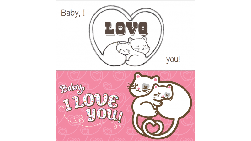
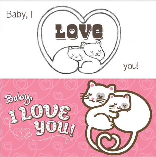
Joyce Wan – Hug You, Kiss You, Love You
Joyce says, "This is the original sketch for the ending of Hug You, Kiss You, Love You. In the final drawing, the cats were changed so that they could be bigger on the page and to make the ending more snuggly."
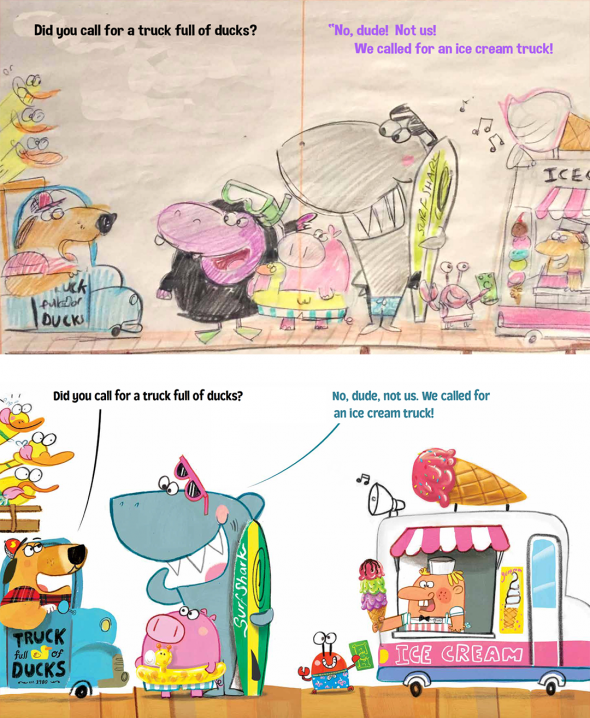
Ross Burach – Truck Full of Ducks (coming this spring!)
Ross says, "We decided there were too many secondary characters crowding the scene, drawing the readers’ attention away from who was speaking and not allowing enough room for the ice cream truck. We determined the surfing shark would be the funniest character to deliver the dialogue, so I eliminated the hippo in the wet suit and moved the shark to the first half of the spread. This gave the scene room to breathe, and allowed me to draw the entire ice cream truck."
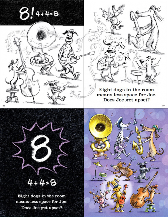
Tom Lichtenheld — Groovy Joe Dance Party Countdown
Tom says, "This was the original sketch for a spread where the math adds up and all the dogs are together in one space. We decided that, since the book is a test of how well Joe will share his space, it would be better to have the math equations get larger as the space for Joe gets smaller. So, the final version looks like this. "

